Timber
2024
Magazine Design
Overview
Timber explores the intersection of design and editorial content through both print and digital magazine formats, examining wooden architecture and environmental narratives from concept to execution.
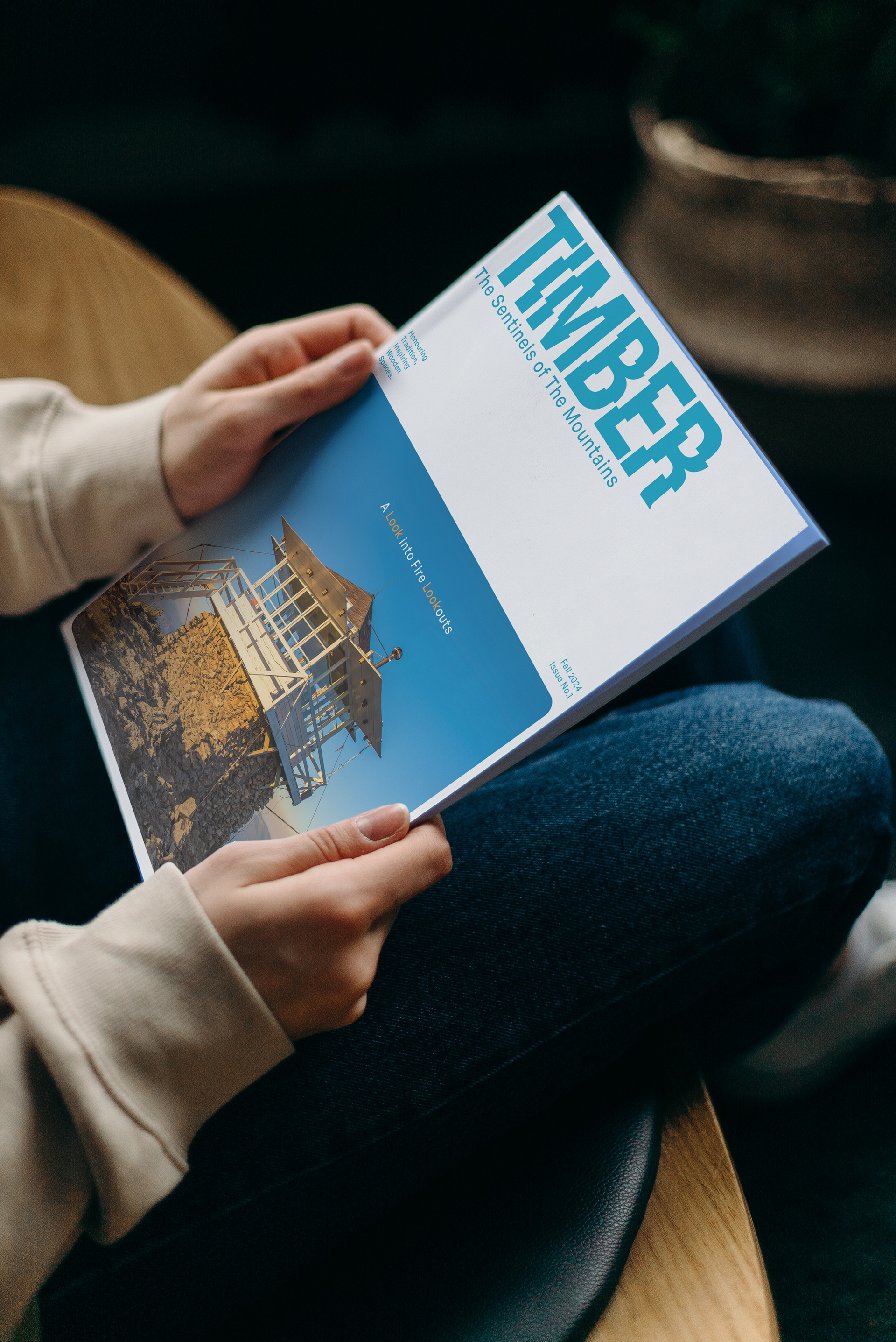
Logo Design
The logo's staggered, layered design elements mirror stacked timber and architectural forms, reinforcing the magazine's focus on wooden architecture. A contemporary sans-serif typeface ensures optimal readability while maintaining strong architectural presence in the visual identity.
Color Choices
The color palette employs a warm blue to evoke calmness, stability, and trust - qualities that reflect the endurance of wooden structures and the natural world. Light orange accents represent energy, warmth, and urgency, speaking to the threat of wildfires. This blue-orange complementary pairing, frequently found in nature, creates a striking visual balance and delivers strong emotional impact.
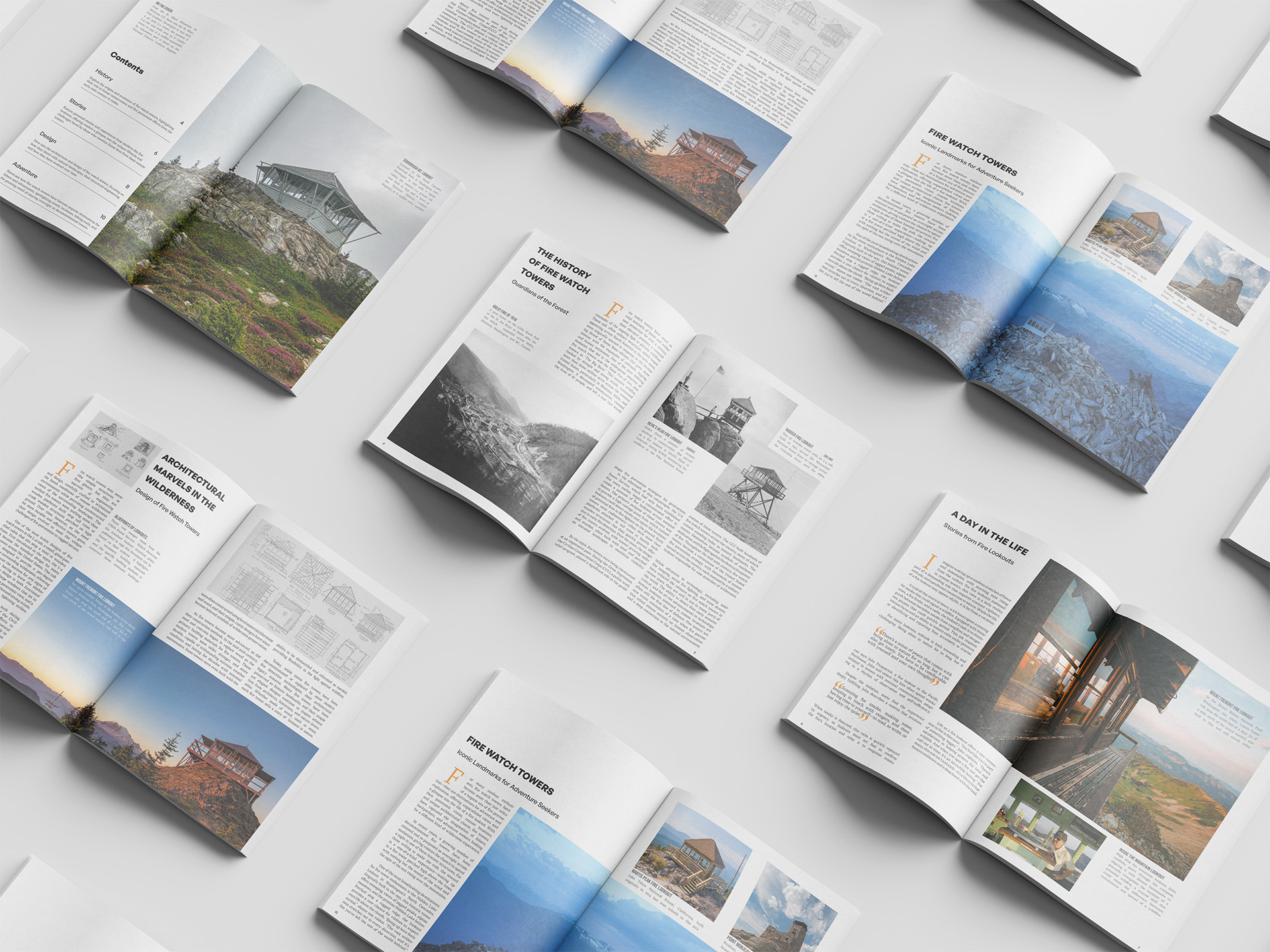
Layout Design
The page layouts balance aesthetic appeal with functional readability through clean, structured design principles. A carefully crafted framework seamlessly integrates textual and visual elements, creating an immersive magazine experience that serves both form and function.
Tools used
Adobe Indesign
Adobe Photoshop
Adobe Illustrator
Digital Version
Spreads of the Print Version