Flare Branding
2024
Brand Design
The branding for Flare was a exciting process in understanding the design evolution of how logos can transform a brand. Into a core part of the design process of the product.
Design Process
Initally Flare was known as Lighthouse representing a protective object that can protect against natural disaters. But as time went on Flare emerged and came to represent a guiding light for people in wildfire prone areas. By providing crucial information in a concise manner.
Tools used
Adobe Photoshop
Adobe Illustrator


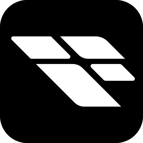
Flare Logo Design Rationale
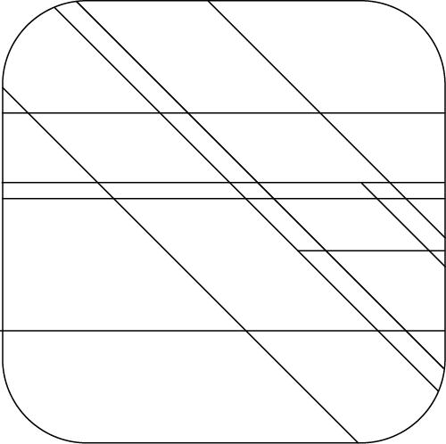
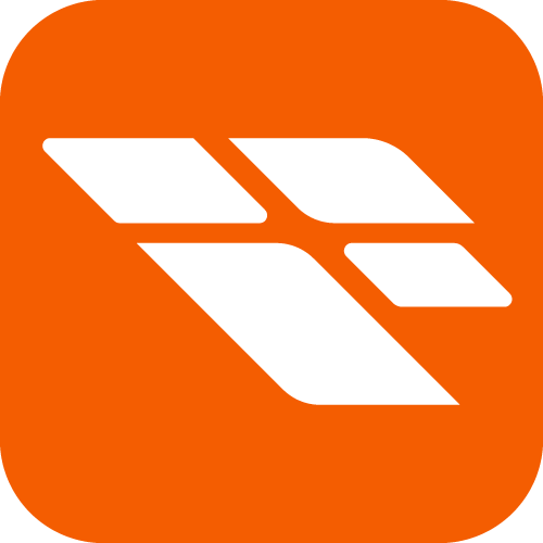
Grid System
The logo integrates a structured grid, symbolizing maps and organization. Subtle grid alignment reflects navigation tools and topographical precision.
Dynamic Angles
Angled elements suggest movement and responsiveness, mirroring the app's proactive approach to wildfire management.
Letter F
The core shape subtly incorporates an abstract 'F', reinforcing brand recognition while maintaining the app's visual identity.
Soft Rounded Corners
Smooth curves make the design approachable and user-friendly, while symbolizing community support integral to wildfire preparedness.
Flare Symbol
A four-pointed flare placed in the center represents emergency alerts, guidance, and visibility to all users in crisis situations.
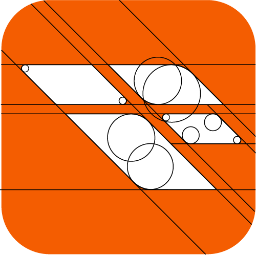
Color Choice
The bright vibrant orange symbolizes fire, warmth, and urgency of wildfire situations, allowing the logo to stand out from other apps.
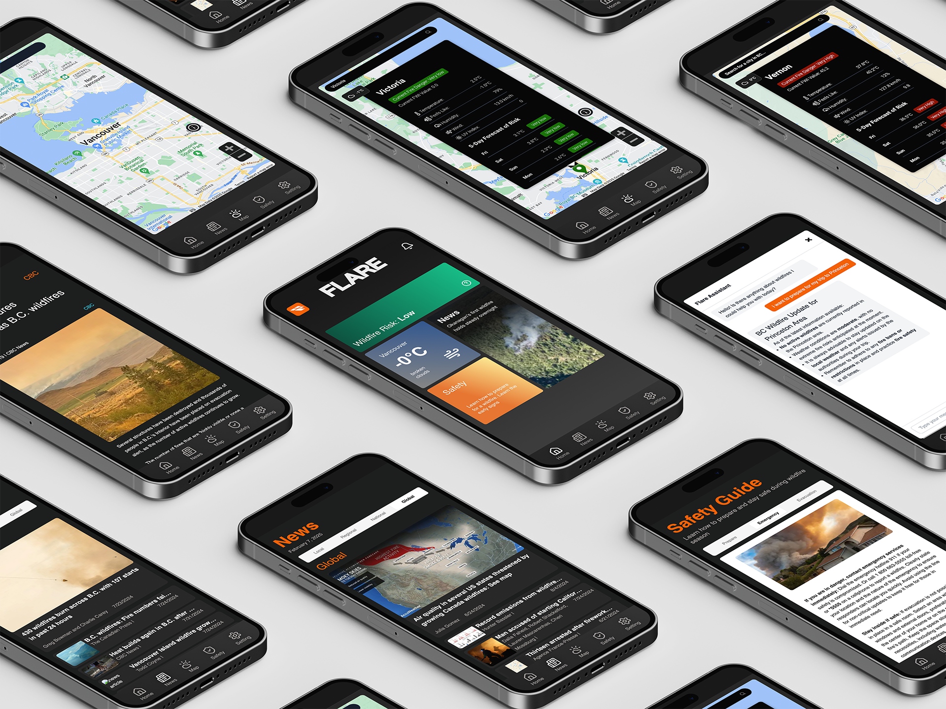
In Action
Styleguide